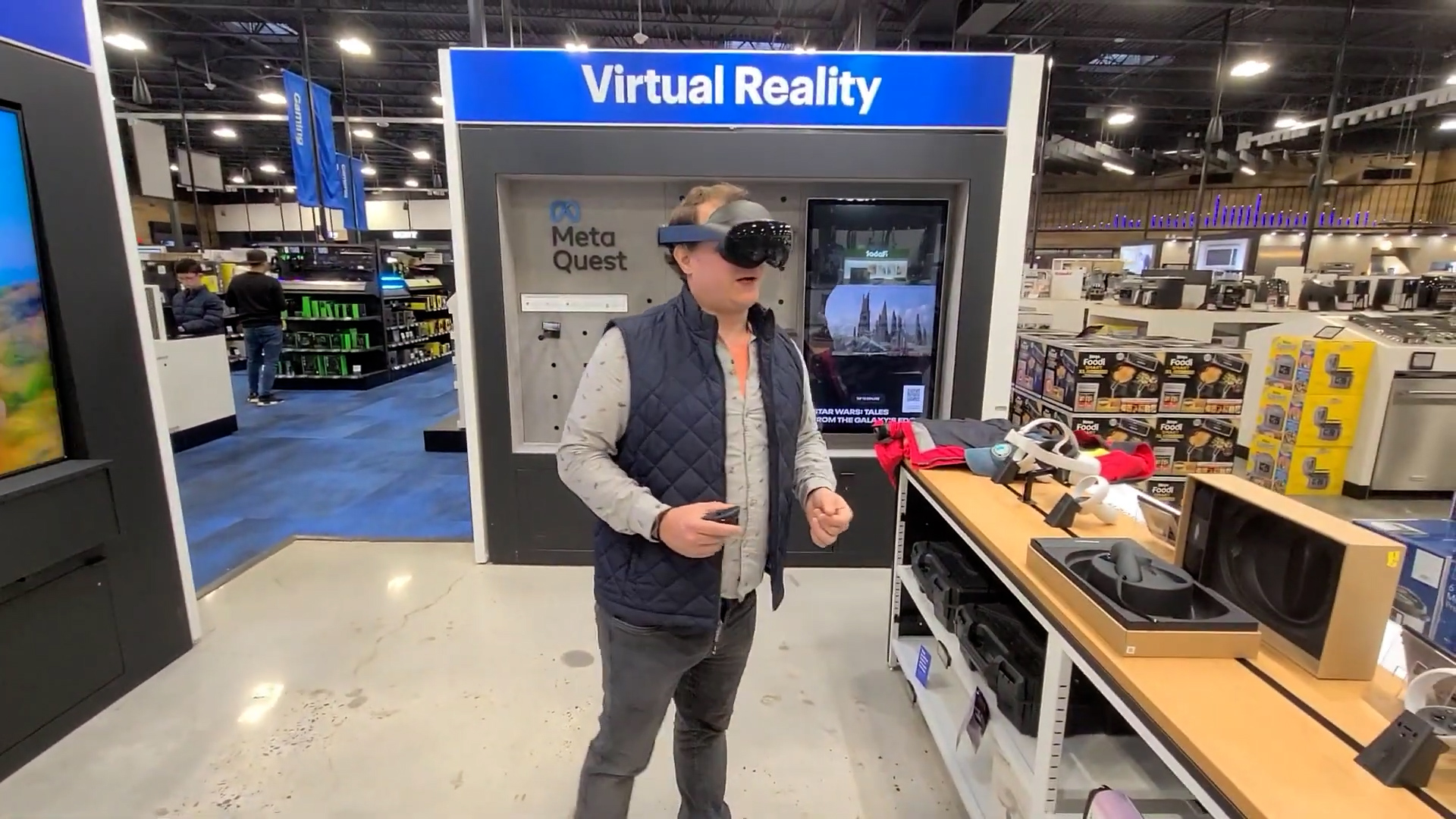
The retail demo was a dynamic, fast-paced project aimed at creating an immersive and interactive guided demo for Gravity Sketch. This experience was tailored for first-time VR users at Meta's retail booths in the US and UK.
Matt Whitby - Product Designer
Will Crane - Software Engineer
Jonathan Ford - Software Engineer
Charlotte Tracey - Senior UX Researcher
Timeframe: 10 weeks
Outcome: Shipped Experience in Retail Stores
Meta approached the Gravity Sketch team with a request to develop a 5 to 8-minute demo for our app, intended to be bundled with their latest Meta Quest Pro and Quest 2 headsets in retail stores. The primary objective was to seamlessly guide users through the VR experience, culminating in a cinematic ending designed to spark excitement about the possibilities of VR.
10 weeks
In response to the tight timeline, our emphasis was on rapidly grasping the desired user experience. Our approach began with a visit to the retail store where the demo was set to unfold, allowing us to comprehend the context and constraints of the space. Leveraging insights from past onboarding projects expedited our progress. Additionally, we conducted a thorough analysis of successful VR apps, seeking to discern the elements that rendered those experiences impactful.
Initially, our team conducted a firsthand exploration of a tech retail store, the designated venue for the demo, to gain insight into the potential end-user experience. This visit provided crucial details about the spatial and contextual factors influencing the demo, prompting us to consider essential UX elements. Notably, we observed that the demo space was relatively confined, necessitating a strategic approach to minimize movement and ensure users could fully engage with the experience without encountering any physical constraints.
Prior to this project, we were actively exploring various approaches and technologies for interactive onboarding experiences. Our efforts included crafting prototypes to guide users in sketching and movement, organizing a game jam to delve into playful teaching methods, and conducting internal usability tests on our prototypes to assess the viability of our concepts. The insights gained from these endeavors played a pivotal role in shaping our approach to the development of this demo experience.
We delved into a myriad of VR tutorials and guided experiences. This exploration allowed us to observe various spatial teaching methods, understand how attention was directed in 3D space, analyze the UI and interactions employed, and identify elements that contributed to the overall fun and impact of an experience. Balancing inspiration with our own capabilities and timeframe, we carefully considered which aspects of these experiences to incorporate into our own experience.
Create a 5 to 8-minute guided demo experience for Gravity Sketch, tailored for deployment in third-party retail stores and the Meta store.
For potential VR consumers demoing headsets for the first time in retail stores across the US and UK.
Design, create, and test two rounds of playable prototypes with small groups of first time users.
To ensure an iterative and user-centered approach, we divided the development phase into multiple rounds of prototyping and usability tests with representative users. This approach enabled us to swiftly make improvements and evaluate our concepts in a real-world context.
In our initial iteration, we modified the UX/UI approach from our previous onboarding experience to incorporate increased guidance, concluding with a cinematic, marketing-oriented animation. This approach aimed to minimize the reliance on text, aligning with our internal design principle of being "language agnostic." Instead, we employed animations and contextual popups to effectively guide and instruct users.
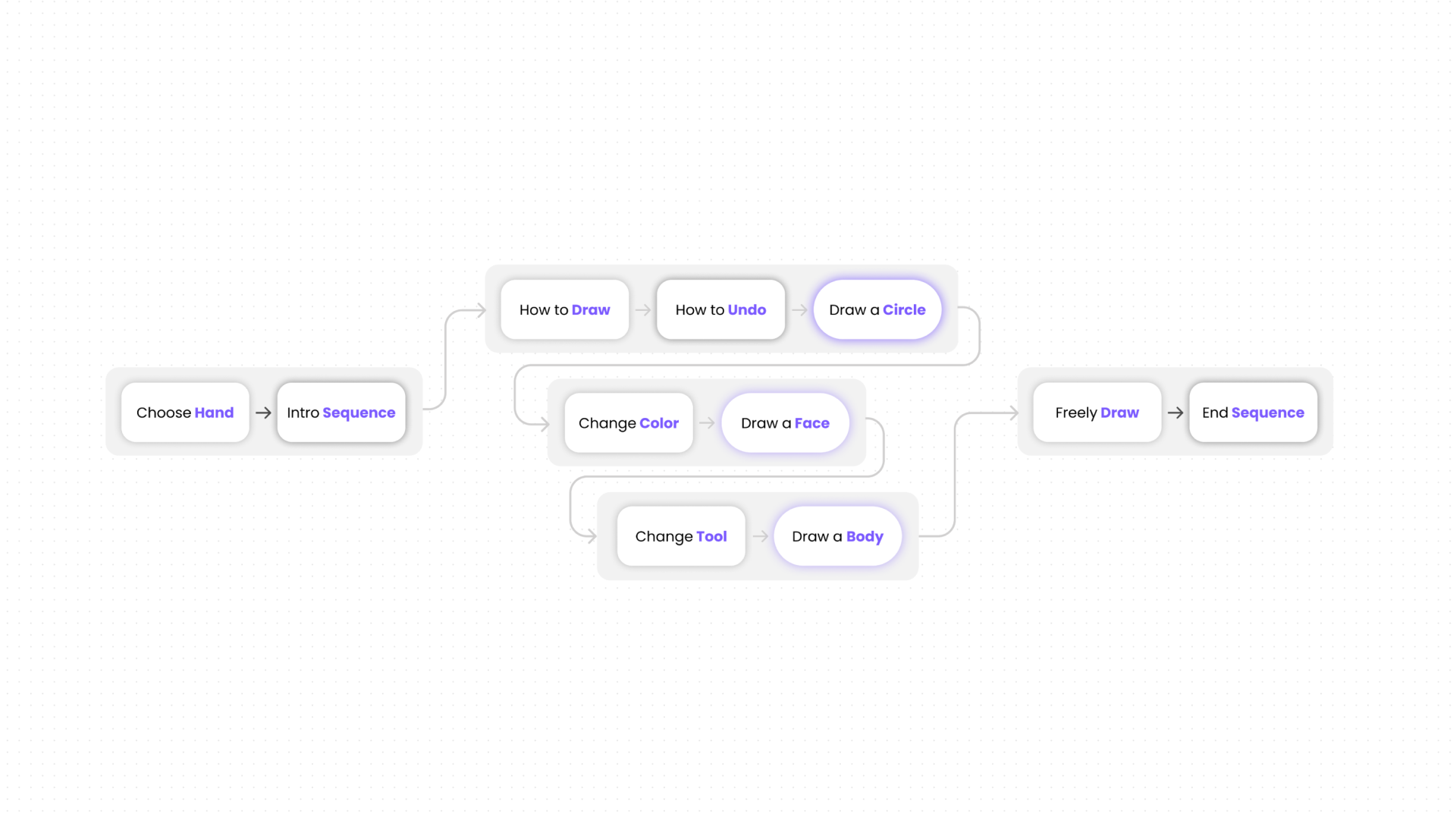
The initial iteration's structure comprised three key segments: the setup and intro, a step-by-step teaching section, and a free drawing interval culminating in an animation sequence. The concept centered around equipping users with the tools to create a simple stick figure, followed by a period for independent sketching and exploration of the software. This approach mirrored the training method employed by our internal design consultant during in-person sessions with customers. Additionally, we chose to commence with sketching a stick figure, providing users with a starting point for the subsequent free drawing section rather than beginning with a blank canvas.
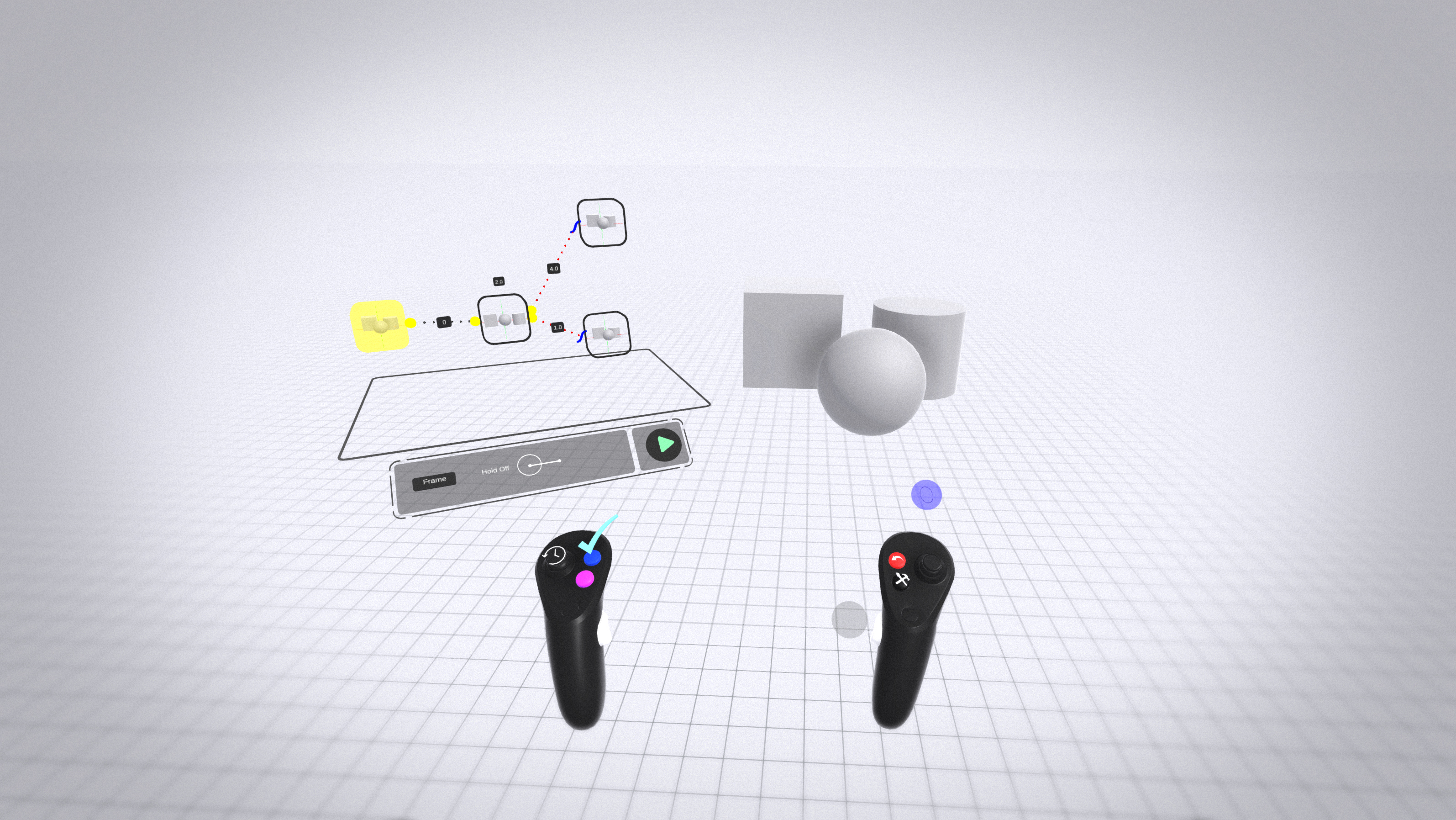
We embraced a gesture-based 3D approach to instruction, employing popup bobbles featuring 3D animations to visually guide users without relying on text or audio. When additional guidance was necessary, we integrated small floating text labels to highlight the required actions. To maintain a balance between simplicity and engagement, we situated the experience on a compact platform within a visually interesting gumdrop environment, aiming to ground users spatially without inducing motion sickness. Furthermore, we crafted an animated hero sequence featuring a sample sketch and a captivating marketing tagline to instill excitement about the potential of Gravity Sketch.
Before diving into this project, I collaborated with our VR engineers to develop internal tools for Unity and GS, empowering me to construct high-fidelity interactive storyboards entirely within GS. The video above highlights the storyboard I crafted for the first iteration using these tools, seamlessly merging Unity-built animations and particle effects with geometry and textures meticulously designed in Gravity Sketch. This served as a crucial handoff document, playing a pivotal role in supporting the development process and conveying the design vision for the initial iteration
Experience from the user’s perspective, the start-to-finish Iteration 1 prototype through this video.
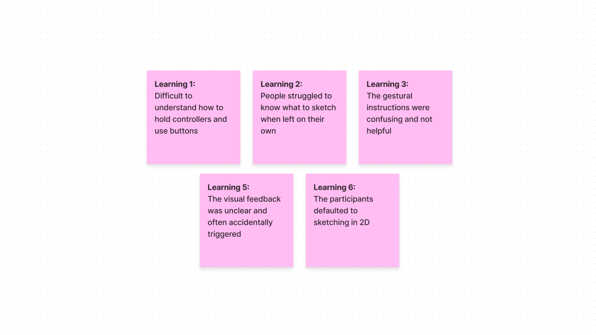
Upon achieving a functional prototype, we partnered with our user researcher to conduct usability tests involving 5 first-time VR users. Insights gleaned from these tests shaped the next iteration of prototyping. We recognized the limitations of relying solely on gesture animations, which proved confusing for users, hindering their comprehension and engagement. Moreover, users faced uncertainty during the free drawing section, leading to premature exits or passive waiting. These findings motivated us to experiment with a fresh UI approach and alter the experience flow.
In response to the insights gained from usability testing, we underwent significant changes in our approach for Iteration 2. We altered what the user created, modified how we guided them, and redefined the concluding elements of the experience. Subsequently, we rigorously assessed these changes through another round of usability testing.
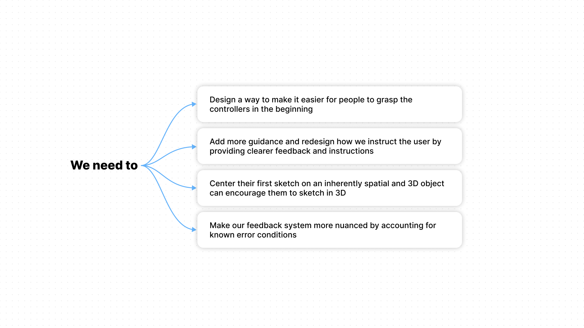
Prioritizing high-impact feedback, we concentrated on innovative methods to enhance user instruction and reduce confusion and frustration. We shifted the user's creative focus to promote more spatial sketching within the experience. Additionally, our efforts were directed towards facilitating user understanding of controls and providing improved feedback in case of errors.
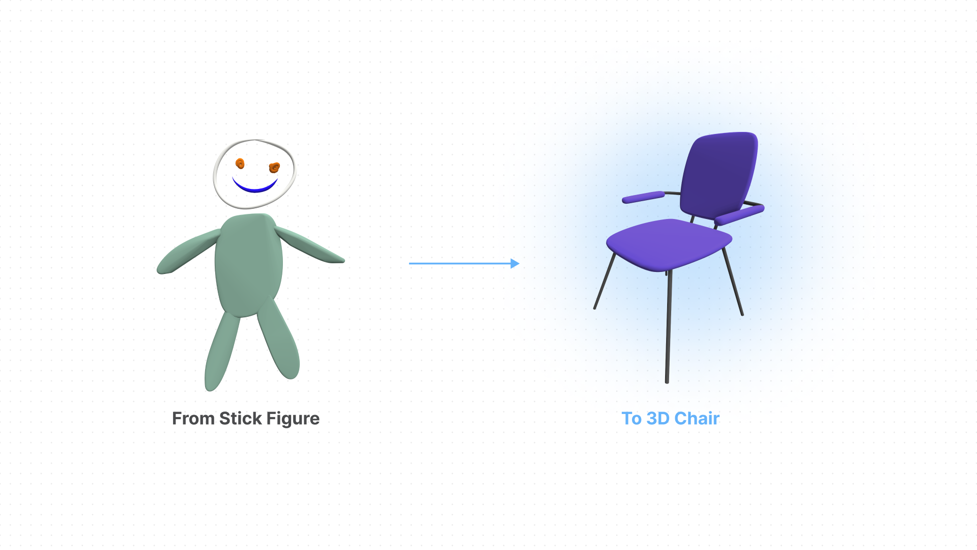
In this iteration, we departed from sketching stick figures, recognizing that their inherently 2D nature posed challenges for users attempting to sketch in 3D space. Many were stationary, sketching in the air as if on paper. To address this, we shifted the drawing subject to a 3D chair. Our goal was to leverage the chair's three-dimensional nature to help users better understand Gravity Sketch's 3D capabilities and encourage more movement within their scenes. The chair also served as a real-life example of how designers utilize the software, offering users the chance to see their sketches at a 1x1 scale, mirroring real-world proportions.
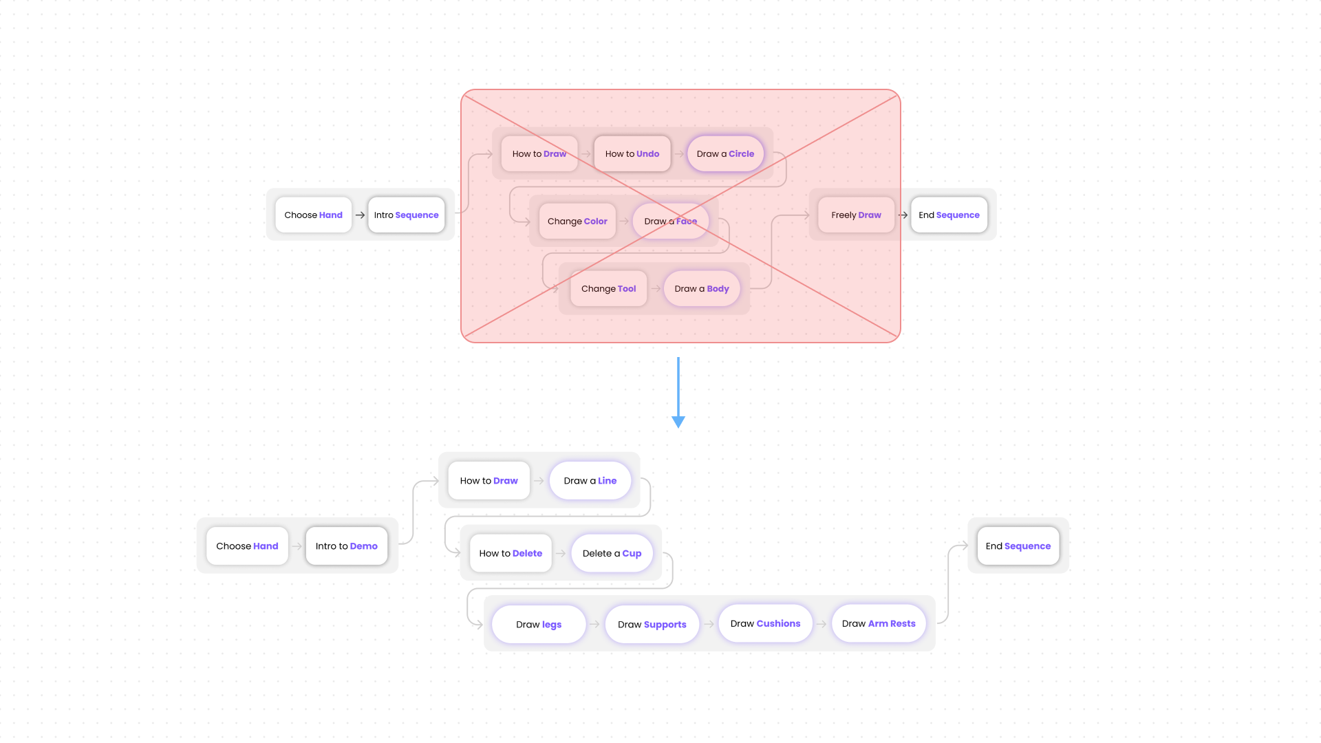
In refining the overall user flow, we maintained a familiar three-part structure while eliminating the free sketch section. We redesigned the teaching segment to be more guided, incorporating in-context feedback to assist users in navigating mistakes. Additionally, a new concluding animation was introduced, presenting impactful value propositions of Gravity Sketch and showcasing the user's work in a cinematic fashion.
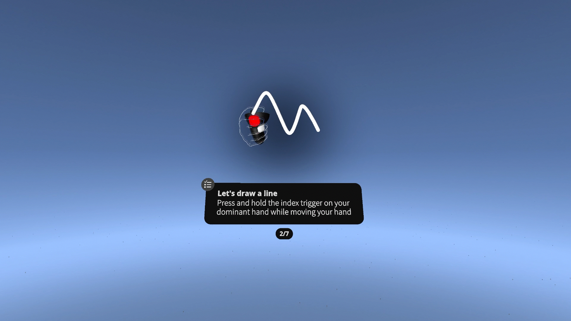
We integrated the concept of gesture animations with task instructions to provide users with clearer guidance on the remaining steps, necessary actions, and the approach to completing each task.
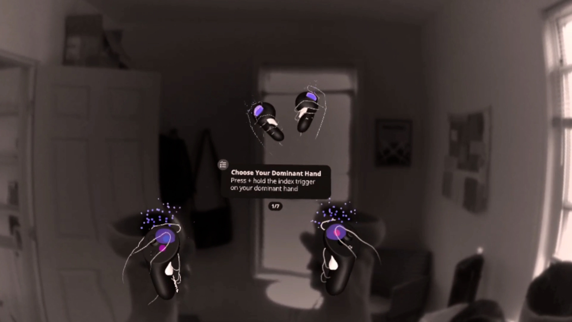
To facilitate a smoother transition into the experience, we opted to commence it in mixed reality passthrough. This allowed users to better visualize the controllers and see the demo instructor, who provided instructions and information on how to properly hold and use the controllers.
After testing with 5 first-time users and implementing improvements from round one, we noticed increased success and user confidence. Some even left excited and ready to sketch more. With clearer instructions, reduced confusion, and positive feedback, we felt confident in moving forward to finalize the experience.
Here's a video presenting the complete final experience from the end user's perspective. This is the version we delivered to Meta and utilized for their in-person retail demos.
Building a fully guided experience was tough but rewarding. This project pushed my skills in Unity animation, shader coding, 3D environment design/building, and creating storyboards to convey the design vision. Needless to say, I learned and grew a lot from this experience.
Looking back, I'd break the project into smaller experiments for faster testing. Testing the entire experience initially slowed us down. I'd also spend less time on high-fidelity storyboards, opting for the lowest fidelity that gets the job done while still conveying the design intent.