First Sketch Tutorial
VR Onboarding Experience for VR Sketching Tool
First Sketch was Gravity Sketch’s first fully immersive, guided experience for new users. It walks them through the essential steps to create a 3D sketch. This is done through an interactive, step-by-step spatial tutorial that shows the user how to set up their scene, become familiar with the controls, and create their own to-scale 3D motorcycle sketch.
My Role
Sole Product Designer
Output
Wireframes & Storyboards
High Fidelity Immersive Design
Micro Interactions
UX Copy
Team Members
VR Software Engineers
Senior UX Researcher
Timeframe
Q3/Q4 2022

Before this project, our app didn't have a complete guide for new users. When users first opened the app, they saw an intro video in the main lobby. After that, they had to figure out how to use the app by going to the 'Learn' tab for tutorials or by watching YouTube videos.
This resulted in…
Bad First Impression
This led to poor reviews on the Meta Quest store and many users feeling frustrated when trying to learn Gravity Sketch. While tech-savvy designers were willing to figure things out on their own, most users quickly lost interest after the second or third day of usage.

High drop off rate
This poor first impression and high level of friction led to high churn after the second and third day of usage.


Costly Live Training
To address this, our internal trainers offered enterprise clients in-person live training sessions. While these sessions were effective, they were not scalable and made it difficult to increase the number of onboarded users in the companies we served.


But we wanted first time users to feel like this…
During live onsite customer visits, we saw 1st time users feel energized and excited when making their first sketch. They didn't have to worry about learning on their own and could just enjoy sketching in 3D. This picture shows a senior design leader's first reaction to using Gravity Sketch during one of these demos. This is what we wanted to achieve through our self-guided tutorial.

Here's what we set out to create…
What
Develop a tailored, guided experience for VR newcomers, leveraging insights and technology gleaned from past projects.
How
Conduct iterative design, prototyping, and testing cycles with target audience representatives to deliver a revamped onboarding experience for the app.
Why
Guide users to discover the value in GS, aiming to boost second-day retention among new users within their first week of usage.


Here's what we knew we needed to include
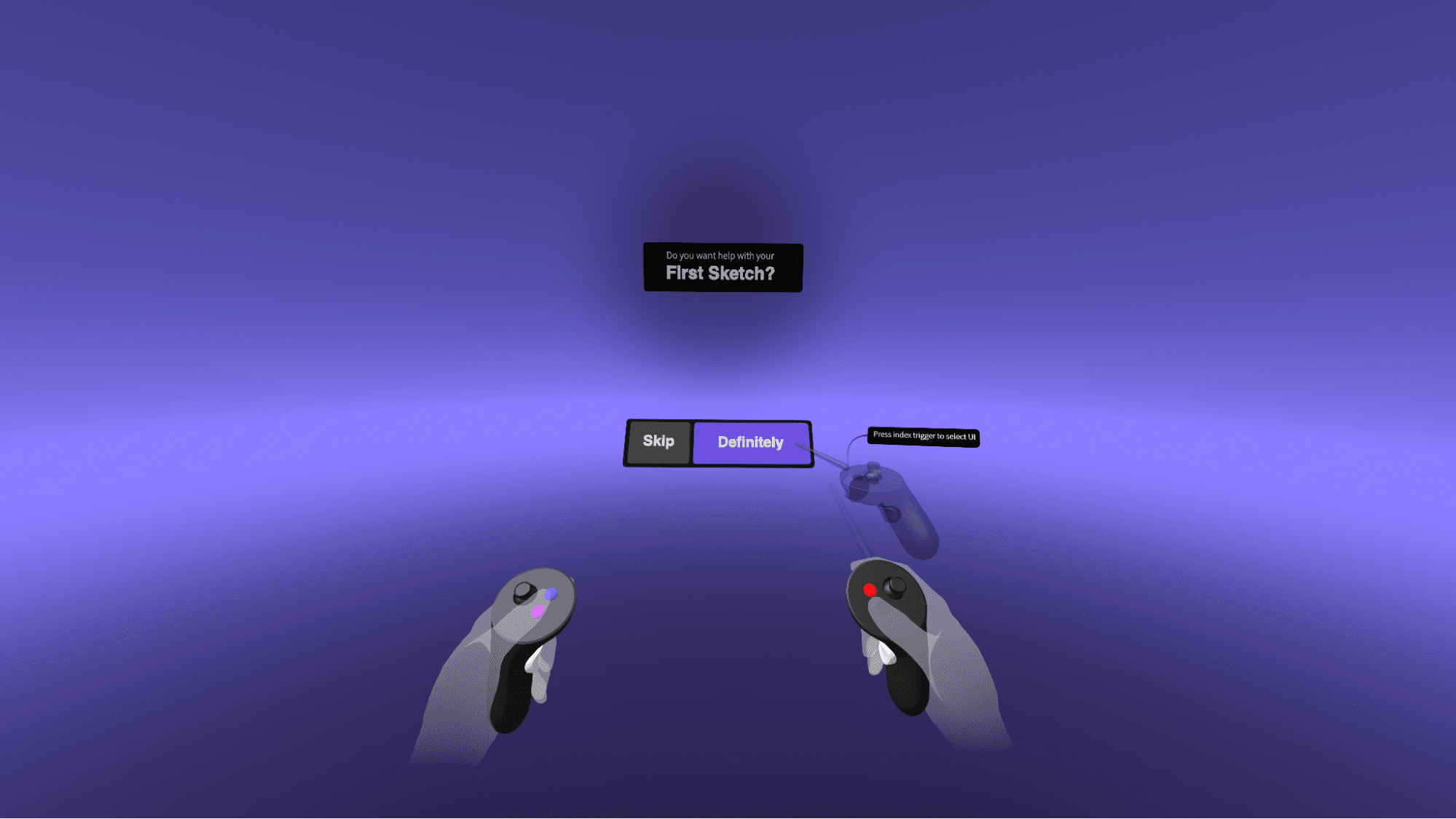
We needed to include a visually appealing intro to improve brand perception, a handedness selection step to help users set up their controls, and an option to opt in or out to accommodate different types of learners.

Intro Animation
Sequence VFX based animation of the logo and environment


We worked with our trainers to decide what skills to teach.
Our design consultants had already developed a curriculum to teach new users the basics. We adapted the core skills they taught to fit a self-guided experience.
Skills to Teach
Moving & Scaling
Sketching & Changing Color
Grabbing
Undo
Past Built Experiences
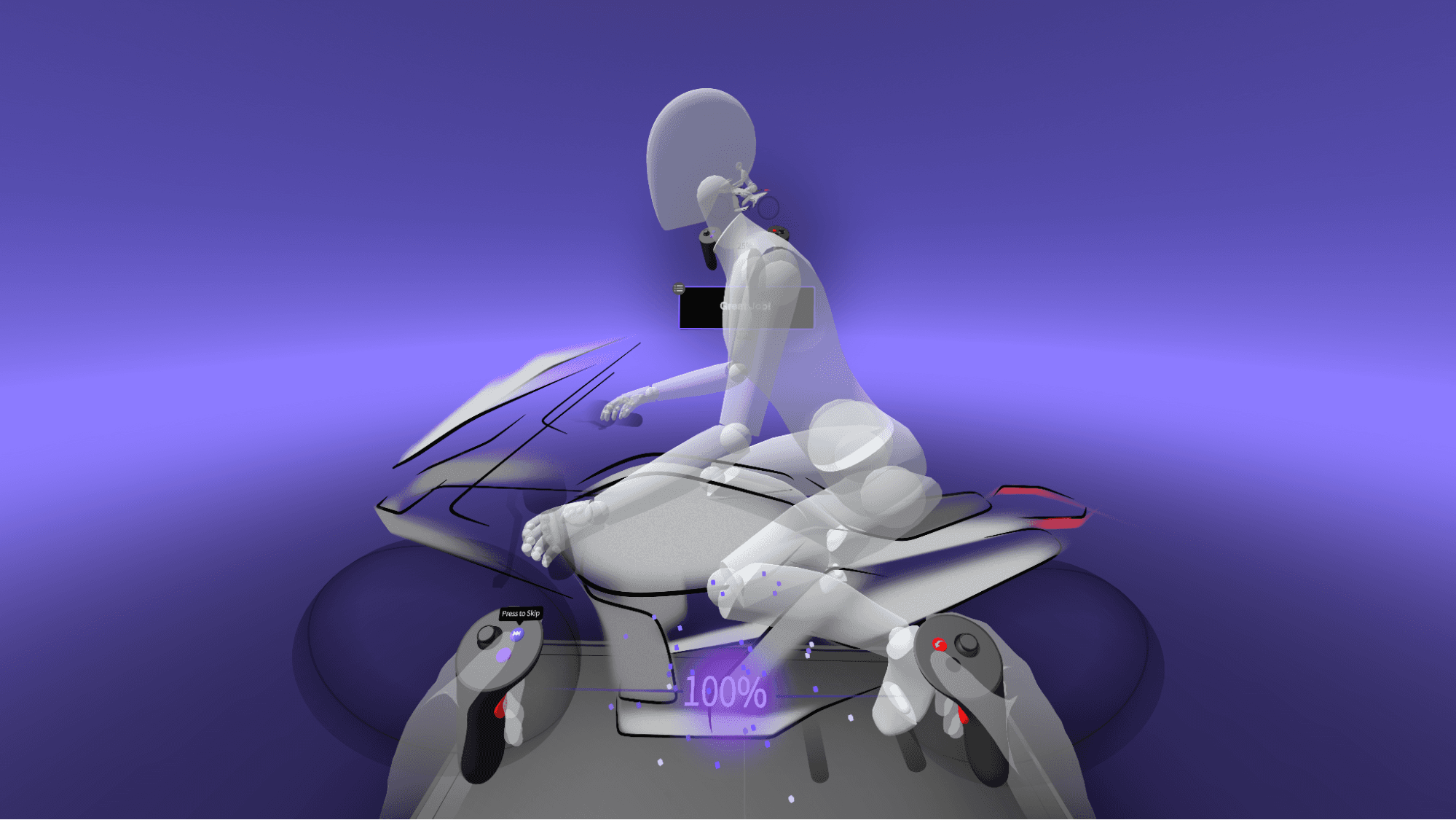
We leveraged technologies, UI insights, and user feedback from past onboarding projects to move faster and build on what we already knew. Notably, we incorporated the well-tested retail demo task panel, visual effects, and pop-up system into the First Sketch Experience.
Project Based Learning
The subject of the experience was a mid-fidelity sketch of a motorcycle I created. We did this to teach through a project and connect the skills to a real-life workflow.
Regular Feedback and Confirmation
To provide a sense of accomplishment and delight, we prioritized including haptic, visual, and auditory feedback whenever a user completed a step or action.
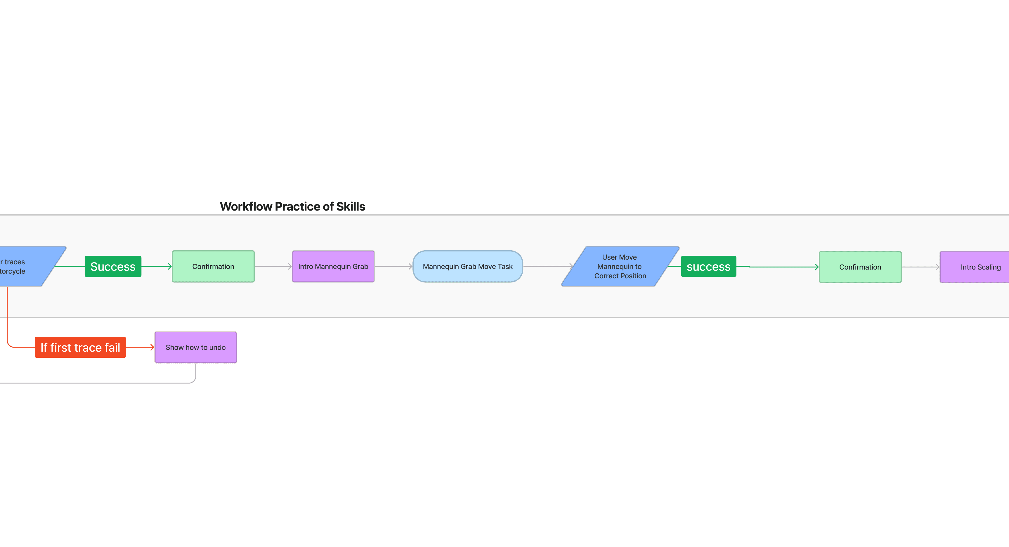
User Journey
The Resulting User Flow


Example UX Design Handoff
Featured above is an example of the high-fidelity storyboards I created to better communicate the design intent and user flow to the engineering team. These were directly used to build the iterations of the experience.


There were two major interaction challenges
For our users to successfully complete the experience without errors, we focused on creating effective visual and haptic feedback and designing strategies to gently guide their attention to the necessary parts of the experience.


_outcome
4
Delivering the Final User Journey
With the design set, we started the delivery phase to improve the details. We worked on better shaders for user feedback, improved the UI, adjusted task success criteria, and set up the technology for future use. The video below shows the final experience.


_task UI
_neutral color palette

_environment & motorcycle project
_accent color palette

_confirmation panel

_chat UI


_tool tips

_error message
_what happened next
5
Users reported having a positive experience of First Sketch during later qualitative data gathering conducted by the research team.
Iterated on the user flow by including signup earlier in the process, fixing confusing UX copy, and restructuring how users entered the experience.
Utilized the First Sketch UI system in later feature specific onboarding experiences.
_reflection
The main lesson from this project was the need for early and regular communication with everyone involved to stay on the same page. Also, I got better at thinking about user interfaces in a more organized way and aimed to make solutions that can grow easily.
_learning
Early in the project, we decided to steer users away from parts of the VR app that needed work to make their first experience better. But when we launched, this confused new users who had a hard time understanding where they were in the app. Looking back, I realize it's better to use what's available more effectively and make improvements iteratively to enhance the user experience.